Banco BPM • Design System
Creating an effecient and consistent design system for products and digital experiences, helping to create visual and functional consistency across the platform.
Role
Client
Banco BPM
UI/UX
Sketch, InVision, Illustrator
Year
2021
Tools
What was the problem?
INCONSISTENCIES
With all the product teams building every component from scratch, we started noticing inconsistencies across the company. Incoherence across the experience of the service has negative effects on the perception of Banco BPM and their products.
Although this input example may seem simple, the lack of consistency
and chaos is clear.
the lack of a grid system
no color rules for each element of the component
variations in the style of the icons
Method
DISCOVER
We identified the pain points and determined the methodology in order to set correctly the Design system.
Analysis of all available sources (HTML, UX/UI files, VPN, Guidelines) and mapping of all components.
ANALYSE
DEVELOP
Analysis of all available sources (HTML, UX/UI files, VPN, Guidelines) and mapping of all components.
DELIVER
Product assets are delivered to the development team to implement the following DS guidelines.
1. Grid System
The best way to achieve a page layout is applying a grid system. The grid is the skeleton of the design, through which we can make guided design decisions and create a better experience for our users. We defined the grid for both devices
Desktop Mobile
Number of Columns: 12 Number of Columns: 6
Column Width: 67 px Column Width: 44 px
Gutter Width: 16 px Gutter Width: 16 px
Offset: 16 px Offset: 16 px
2. Typography
The font chosen for the portal is Roboto.
Its anatomy allows a more natural reading rhythm and better use of the contents.
This font has the core features for a banking portal:
High readability and clarity, suitable therefore for pages rich in content such as informative and compilative;
A visual identity that conveys confidence to the user for the actions to be taken.
Text styles are used in different sizes and weights depending on their function and in relation to the device.
3. Color System
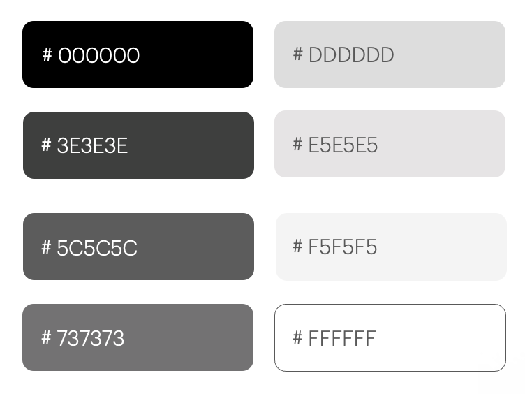
Neutral Colors
These colors are mainly used for background and for medium emphasis elements like text, icons, and component outlines. The different nuances ensure right contrasts and depth and define various interactive states of the components.
Semantic Colors
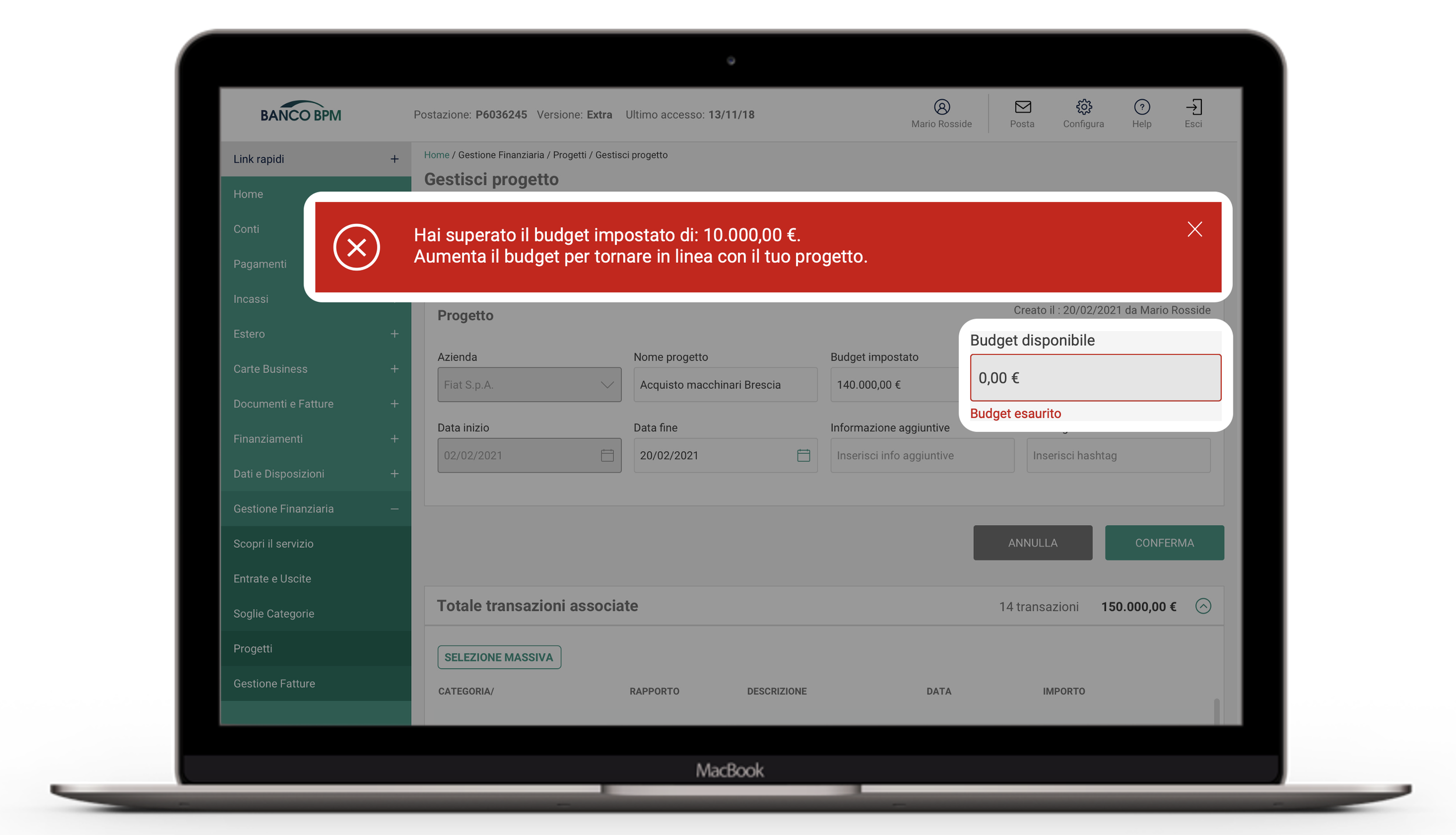
In addition to the neutral and accent colors, the color system includes semantic color role for success, warning and error.
These colors are used to
Highlight an important status
To validate fields
Message handling
Brand Identity - Accent Colors
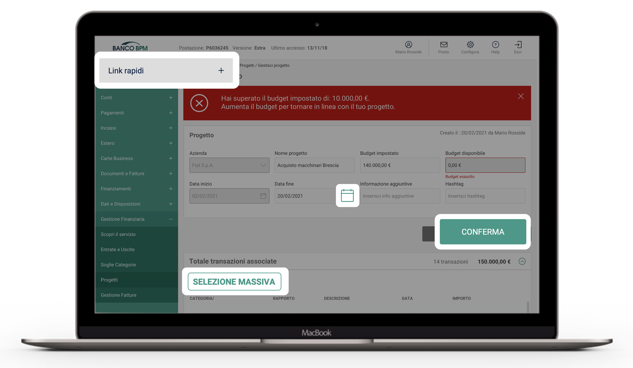
The primary color is used for key components across the UI, such as the FAB, prominent buttons and active states.
The secondary is used for less prominent components such as filter chips.
The tertiary key color is used for accents expanding the opportunity for color expression.
4. Illustrasions Set
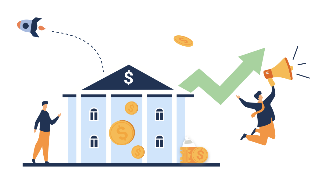
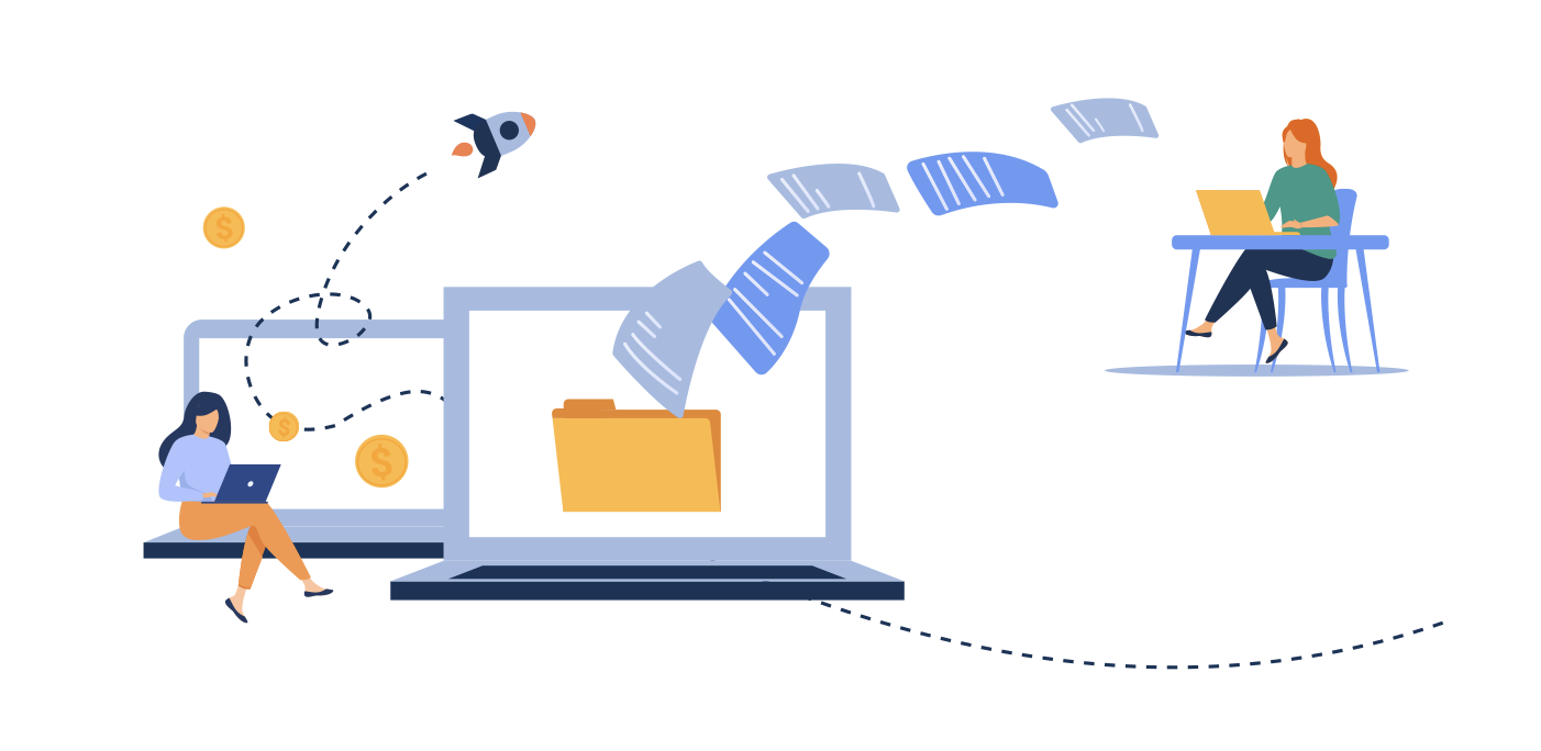
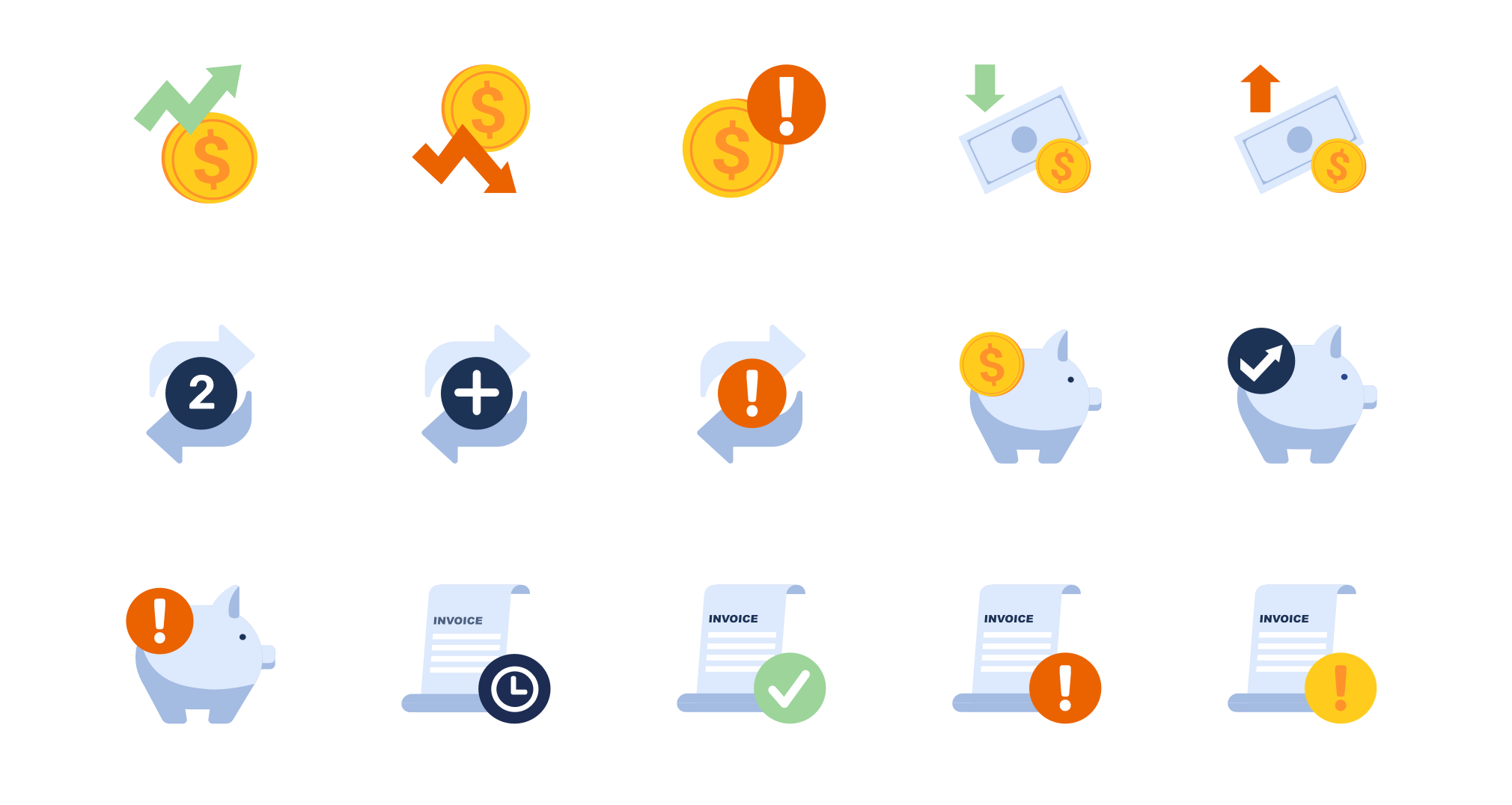
One of the main goals we had in designing the Design System was to create a set of illustrations for the brand, in order to enrich its visual language.
Big Illustrations
Small Illustrations
I loved bringing out the playfulness and warmth of “serious” concepts for a banking platform - with a limited palette and a lot of energetic movement.
Color Palette
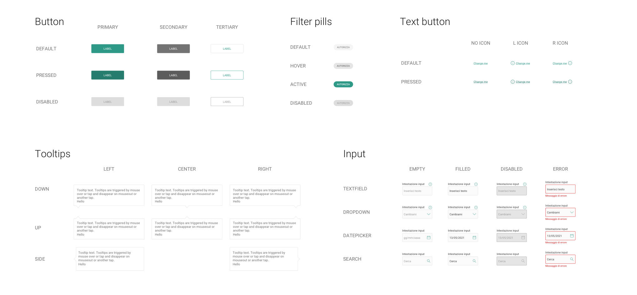
5. Components
1 - Atoms
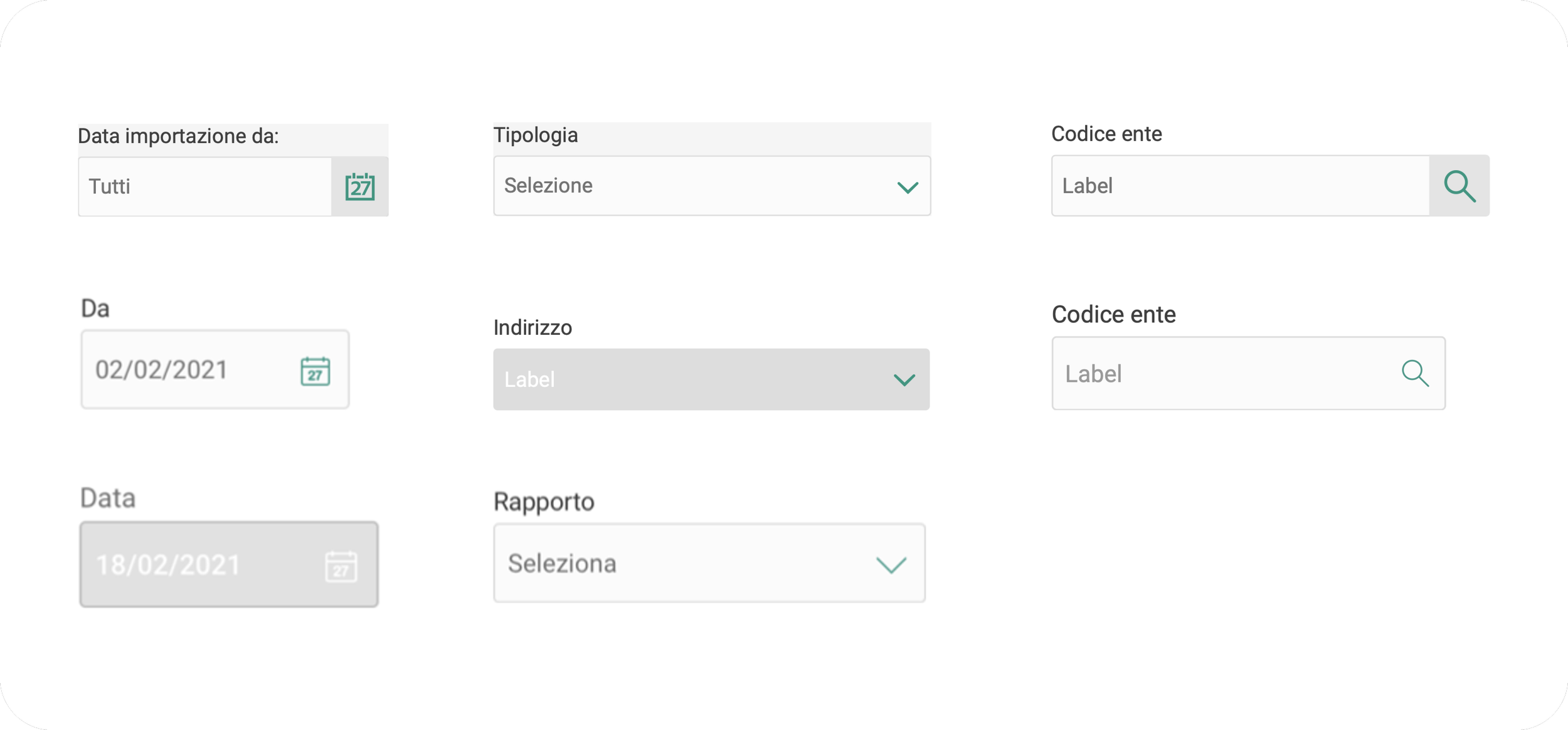
Atoms of our interfaces serve as building blocks that comprise all our user interfaces. These atoms include basic HTML elements like form, labels, inputs, buttons, and others that can’t be broken down any further without ceasing to be functional.
2 - Molecules
Molecules are relatively simple groups of UI elements functioning together as a unit.
For example, a form label, search input, and button can be joined together to create a search form molecule.
3 - Organisms
Organisms are relatively complex UI components composed of groups of molecules and/or atoms and/or other organisms. These organisms form distinct sections of an interface.
4 - Templates
Placing components into a layout and articulate the design’s underlying content structure.
5 - Pages
Pages are specific instances of templates that show what a UI looks like with real representative content in place.
After working closely with the development team to implement the Design System, we shared and launched the guide lines and components library.
After just 2 months of using the Design System the client documented many indicators of success: standardizing decisions across products increased productivity for designers and developers, who can now focus on the business logic and the rare cases where custom UI is necessary.
A win of this magnitude meant enabling scalability and simplifying implementations in accordance with products’ evolution.
Results
